I will be looking at data from the American Community Survey and try to find patterns in the way Americans date, marry and divorce. This is still work in progress but I figured I’d add some plots and maps to begin with.

and looked at the ratio of single men to single women aged 18 - 35 with a college degree. Here’s the graph below. It’s not looking so good for the ladies I am afraid. Move your mouse over any state to find more detailed information.
I am also including the code. I used ACS census data and some munging to get the ratios by state then used the plot_ly function to plot the maps and graphs above.
library(ggplot2)
library(plotly)
library(leaflet)
library(dplyr)
load("/Users/alexpapiu/Documents/R/ACS Census EDA/census.Rd")
ysingles <- filter(cens, AGEP >= 18, AGEP <= 35, MAR %in% c(2,3,4,5))
ysingles.college <- filter(ysingles, SCHL %in% 20:24)
singbysex <- table(ysingles$SEX, ysingles$ST)
ratios <- singbysex[1,]/singbysex[2,] #ratios
singbysex.col <- table(ysingles.college$SEX, ysingles.college$ST)
ratios.col <- singbysex.col[1,]/singbysex.col[2,] #ratios for college
df <- read.csv("https://raw.githubusercontent.com/plotly/datasets/master/2011_us_ag_exports.csv")
ggplotly(ggplot(cens.over15, aes(x = AGEP, ..count.., fill = as.factor(MAR))) +
geom_density(position = 'identity', alpha = 0.4) +
xlab("Age") + ylab("Count") +
scale_fill_discrete(name = "Marital Status",
labels = c("Married", "Widowed", "Divorced",
"Separated", "Never Married")))
singles.state <- data.frame(code = df$code, ratios = ratios[-11],
ratios.col = ratios.col[-11]) #no washingoton DC
singles.state$men <- floor(singles.state$ratios*100)
singles.state$mencol <- floor(singles.state$ratios.col*100)
singles.state$state <- df$state
singles.state$hover1 <- with(singles.state,
paste(state, "<br>", men, " single men per 100 single women" ) )
singles.state$hover2 <- with(singles.state,
paste(state, "<br>", mencol, " single men for every 100 single women" ) )
g <- list(
scope = 'usa',
projection = list(type = 'albers usa'),
showlakes = TRUE,
lakecolor = toRGB('white')
)
#singles ratios
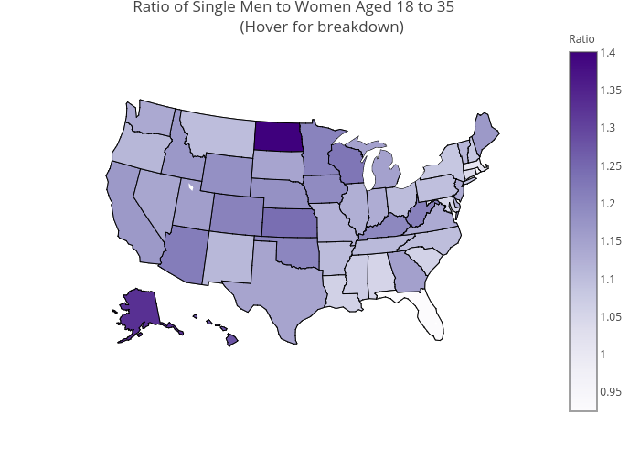
plot_ly(singles.state, z = ratios, locations = code, type = 'choropleth',
locationmode = 'USA-states', color = ratios, colors = 'Purples',
text = hover1, colorbar = list(title = "Ratio")) %>%
layout(title = 'Ratio of Single Men to Women Aged 18 to 35
<br> (Hover for breakdown)', geo = g)
#college singles ratios
plot_ly(singles.state, z = ratios.col, locations = code, type = 'choropleth',
locationmode = 'USA-states', color = ratios.col, colors = 'Purples',
text = hover2, colorbar = list(title = "Ratio")) %>%
layout(title = 'Ratio of Colege Educated Single Men to Women <br> (Hover for breakdown)',geo = g)