We will be looking at the MNIST data set on Kaggle. The goal in this competition is to take an image of a handwritten single digit, and determine what that digit is. We’ll start with some exploratory data analysis and then trying to build some predictive models to predict the correct label.
Let’s load up the data from the Kaggle competition:
library(ggplot2)
load("train.Rd")
dim(train)
## [1] 42000 785head(train[1:8])## label pixel0 pixel1 pixel2 pixel3 pixel4 pixel5 pixel6
## 1 1 0 0 0 0 0 0 0
## 2 0 0 0 0 0 0 0 0
## 3 1 0 0 0 0 0 0 0
## 4 4 0 0 0 0 0 0 0
## 5 0 0 0 0 0 0 0 0
## 6 0 0 0 0 0 0 0 0train$label <- as.factor(train$label)So we basically have 42000 examples with each example having 784 features - pixels in this case and a label - the digit the image represent. It’s actually pretty easy to reconstruct the image from the vector of pixels and we do this below. First I construct a square matrix form the vector and then use image to diplay it.
digit <- matrix(as.numeric(train[8,-1]), nrow = 28) #look at one digit
image(digit, col = grey.colors(255))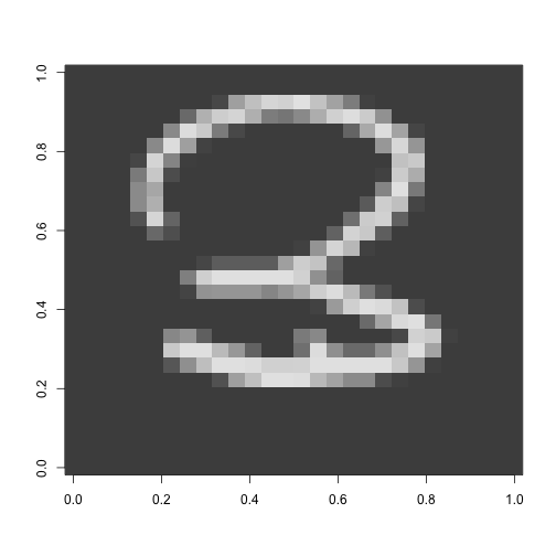
Looks like a 3!
Since I want this to be a self-contained reproducible post I will split the training set into a test set and a training set just so I don’t have to log into Kaggle to test the results.
Let’s play around and see if we can extract any features from the pixels that can be more informative. First I’d like to know more about average intensity - that is the average value of a pixel in an image for the different digits. Intuition tells me that the digit “1” will have on average have less intensity than say an “8”. Below I create a new feature that is the average of the pixel intensity and then use the R function aggregate (extermely useful in these situations) to look at averages by label. Then I plot the average intensity using qplot frmo the ggplot2 package.
train$intensity <- apply(train[,-1], 1, mean) #takes the mean of each row in train

intbylabel <- aggregate (train$intensity, by = list(train$label), FUN = mean)

plot <- ggplot(data=intbylabel, aes(x=Group.1, y = x)) +
    geom_bar(stat="identity")
plot + scale_x_discrete(limits=0:9) + xlab("digit label") +
    ylab("average intensity")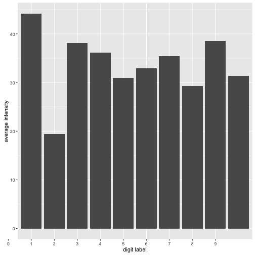
As we can see there are some differences in intensity. The digit “1” is the less intense while the digit “0” is the most intense. So this new feature seems to have some predictive value if you wanted to know if say your digit is a “1” or no. But the problem of course is that different peple write their digits differently. We can get a sense of this by plotting the distribution of the average intensity by label. The plot below is interactive so you can click on the legend to select various digits and look at their ditributions.
What can we observe from the histograms above? Well most intensity distributions seem roughly normally distributed but some have higher variance than others. The digit “1” seems to be the one people write most consistently across the board. Other than that the intensity feature isn’t all that helpful. Also sometimes density plots can be decieving so let’s plot some historgrams for selected numbers. My guess is that 4 and 7 will have the highest variablilty. Growing up in Romania I was taught to “line” my sevens. In the US people don’t really do that, but I’m curious if there are other weirdos like me :)
p1 <- qplot(subset(train, label ==1)$intensity, binwidth = .75,
xlab = "Intensity Histogram for 1")
p2 <- qplot(subset(train, label ==4)$intensity, binwidth = .75,
xlab = "Intensity Histogram for 4")
p3 <- qplot(subset(train, label ==7)$intensity, binwidth = .75,
xlab = "Intensity Histogram for 7")
p4 <- qplot(subset(train, label ==9)$intensity, binwidth = .75,
xlab = "Intensity Histogram for 9")
grid.arrange(p1, p2, p3,p4, ncol = 2)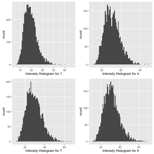 It does seem that the intensity distributions for 4 and 7 are less “normal” than the distrubution for 1. The diestribution for 4 looks almost bimodal - a telling sign thay perhaps there are two different ways people tend to write their fours.
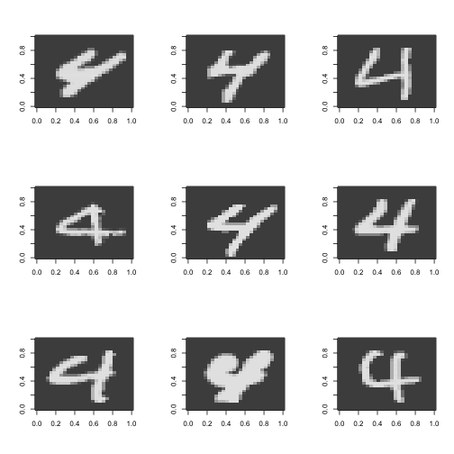
Let’s take a look at some images of fours and sevens. I also define a function flip that flips the image vertically. In order to make this work, we’re going to flip the image and reverse it.
It does seem that the intensity distributions for 4 and 7 are less “normal” than the distrubution for 1. The diestribution for 4 looks almost bimodal - a telling sign thay perhaps there are two different ways people tend to write their fours.
Let’s take a look at some images of fours and sevens. I also define a function flip that flips the image vertically. In order to make this work, we’re going to flip the image and reverse it.
train4 <- train[train$label == 4, ]
train7 <- train[train$label == 7, ]

flip <- function(matrix){
    apply(matrix, 2, rev)
}

par(mfrow=c(3,3))
for (i in 20:28){
    digit <- flip(matrix(rev(as.numeric(train4[i,-c(1, 786)])), nrow = 28)) #look at one digit
    image(digit, col = grey.colors(255))
}
#a bunch of fours some are different


par(mfrow=c(3,3))
for (i in 10:18){
    digit <- flip(matrix(rev(as.numeric(train7[i,-c(1, 786)])), nrow = 28)) #look at one digit
    image(digit, col = grey.colors(255))
}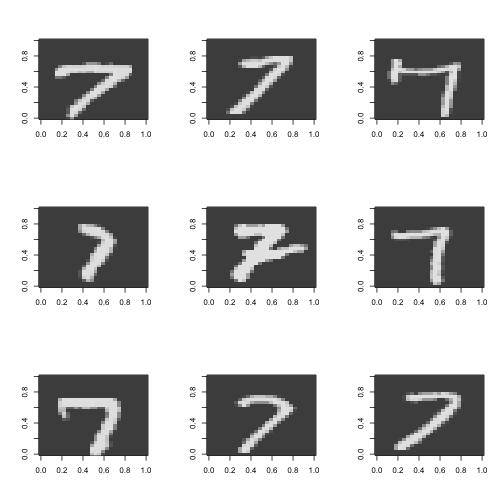
Guess I am not so weird after all! See that seven in the middle, the one with the line though it? That’s how I do it. Also notice how there are two different ways to do four as well. Interestingly these two are topologically different. One way has a “hole”” in the middle and the other doesn’t. I was considering at first a topological approach to this classification - perhaps counting the holes in the digits but given the variability in the writing this will probably not work.
So we’ve discovered two useful facts so far: average intensity could have some predictive power and also that there is a lot of variability in the way people write digits.
###Symmetry as a factor:
Some digits are symmetric (1, 3, 8, 0) some are not (2, 4, 5, 6, 8, 9). Creating a new feature capturing this could be useful. Let’s see how can we go about this. Here’s some code that creates a new feature called symmetry.
par(mfrow = c(1,1))
pixels <- train[,-c(1, 786)]/255

symmetry <-  function(vect) {
    matrix <- flip(matrix(rev(unlist(vect))))
    flipped <- flip(matrix)
    diff <- flipped - matrix
    return(sum(diff*diff))
}

symmetry((pixels[1,]))
## [1] 27.01918sym <- (apply(X = pixels, MARGIN = 1, FUN = symmetry))
means <- numeric(10)
for (i in 0:9){
means[i+1] <- mean(sym[train$label == i])
}
means <- (means/intbylabel[,2])**(-1)
mean <- data.frame( label = 0:9,symmetry = means)
plot <- ggplot(data=mean, aes(x= label, y = symmetry)) +
geom_bar(stat="identity")
plot + scale_x_discrete(limits=0:9) + xlab("digit label") +
ylab("symmetry") #plots the avg intensity by label but it won't work.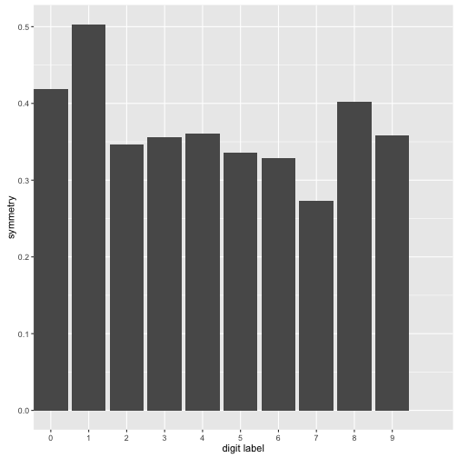
What I have done above is create a new feature called symmetry. I wasn’t exactly sure how to go about this so I just flipped the image matrix and subtracted it from the original. Then I looked at the “magnitude of the matrix” normalized it by the average intensity of each digit. With the normalizing - the more intense digits would be less symmetric simply because they have a higher average intensitiy. What can we observe from the plot above: 7 is the least symmetric digit by our computations while 1 is the most symmetric digit. The differences aren’t that big however however this new feature does capture symmetry to some extent.
Building a Predictive Model:
A lot more can be said about Feature Extraction on this dataset but I’d like to actually throw some algorithms at the data see how they perform. We have in this case a classification problem where the response variable has 10 different labels. Usually logistic regression is a good first choice for classification but since our response is not binary things are a bit more complicated. Off the top of my head I’d probably do \({10 \choose x2} = 45\) different binary logistic regresions for each combination of labels and then do a majority vote. Instead let’s use decision trees.
model <- rpart(label ~ ., data = train)
pred_tree <- predict(model, train1, type = "class")
truth <- table(predictions, train$label)
accuracy <- sum(diag(truth))/length(train[,1]) #ouch accurcy is .63 still better than .1
Aaaand we get an accurcay of 63% on the training set…not too great. Keep in mind however that a blind guess would give us an accurcay of only 10% since there are 10 different labels.
Ok so a tree didn’t do that great but maybe an ensemble of trees will do better?
Random Forests:
Random Forests seems like a decent option in this case since it can easily deal with the multiple responses. The only issue with this algorithm is that we it can be quite computationally intensive.
There are a few parameters we’ll have to worry about. The first one is the number of trees or boostrap samples for each bagging round. A larger number usually gives better test error without leading to overfitting but it also makes the computation more expensive. The second one is the number of features to be chosen in each bagging round: we’ll just keep the default from the randomForest implementation, the integer closest to \(\sqrt(10)\) in this case. Let’s try doing it with 50 trees.
library(randomForest)
library(readr)

set.seed(132)
numTrain <- 40000
numTrees <- 50

rows <- sample(1:nrow(train), numTrain)
labels <- as.factor(train[rows,1])
train1 <- train[rows,-1]

rf <- randomForest(train1, labels, ntree=numTrees)
With the randomForests with 50 trees we get an out of bag error of 0.04685000. Significantly better than what we had before! Also keep in mind that the out of bag (OOB) error is an unbiased estimate of the test error. Also randomForests has a cool feature that allows us to see the OOB error based on the number of bagging rounds simply by calling plot(rf).
The plot below gives us the OOB error by number of trees (or bagging rounds). It also slipts the error by label. We can see that the error decreases with the number of trees which is to be expected. However the rate of decrease is well, also decreasing. It looks like having more trees would only decrease the error rate very marginally - this is good news since my poor Macbook Pro had a hard time doing the algorithm even with 50 trees.
plot(rf)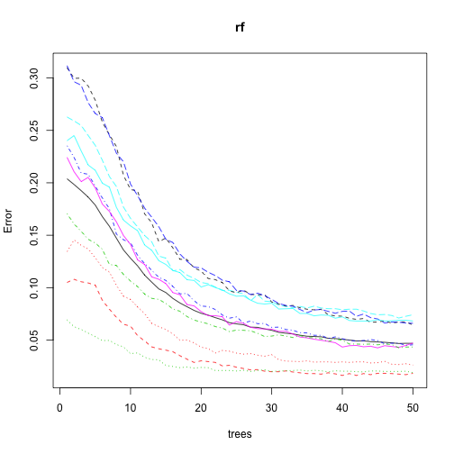
Another intersting thing is that not all digits have the same errors. And this makes sense: it is easier to differentiate between a 1 and a 0 than between a 4 and a 7. Let’s take a closer look at this by plotting the OOB error for each label.
err <- rf$err.rate #this is just OOB by label by number of trees

errbydigit <- data.frame(Label = 1:9,Error = err[50, 2:10]) #error is the last row
errdigitplot <- ggplot(data=errbydigit, aes(x=Label, y =Error)) +
    geom_bar(stat="identity")
errdigitplot + scale_x_discrete(limits=0:9) + xlab("Digit Label") +
    ylab("Error")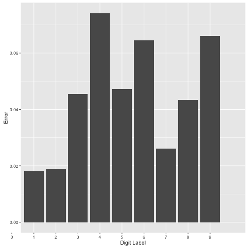
As we can see above not all digits are created equal. The digits “4”, “9” and “6” have the largest errors.
Learning Curves for RF:
Another important questions we can ask: would we be better off with more data? And If so how much better? Converserly, perhaps we can obtaine the same error rates with significantly less data. One way to figure this out is to use learning curves. The entails varying the number of training examples and analyzing what happens to the training error and, more importantly the test error. Since in our case the randomForest algorithm almost always gives 100% in sample accuracy we will focus on the out of sample error. To be more precise we will plot the estimate of the out of sample error given by the out of bag error.
trainnumb <- c(1000, 2500, 5000, 7500, 10000, 12500, 15000, 20000, 25000, 30000,
               35000, 40000)

numTrees <- 25 #let's just do this to speed things up
j = 1
lcerror <- numeric(length(trainnumb))
trainerror <-  numeric(length(trainnumb))
for (i in trainnumb) {
    numTrain = i

    rows <- sample(1:nrow(train), numTrain)
    labels <- as.factor(train[rows,1])
    train1 <- train[rows,-1]

    rf1 <- randomForest(train1, labels, ntree=numTrees)
    err1 <- rf1$err.rate
    lcerror[j] = err1[dim(err1)[1], 1]

    tabs <- table(predict(rf1, train1), labels)
    tabs
    trainerror[j] <- 1 - sum(diag(tabs))/length(train1[,1]) #Ein
    j = j+1
}plot(learncurves, ylim = c(0,.25), xlab = "Training Examples",
ylab = "OOB Error", main = "Learning Curves")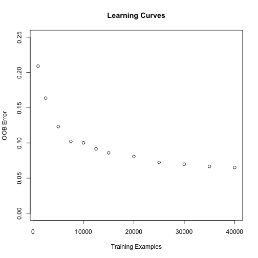
As expected the more data we have the smaller our OOB error will be. It looks like having more data would improve our accuracy but not by much, the largest decrease in the error is until around 20000 examples - the error seems to stabilize somewhat after that.